Visual Identity
Forsa Digital Solutions
A new visual identity for a startup empowering small businesses to make smarter, informed decisions through custom data solutions.
The Brief
Forsa Digital Solutions is a startup empowering small businesses to make smarter, informed decisions through custom data solutions, built to solve the problem of poor decision-making caused by messy data.
The company needed a brand that felt efficient, approachable, and transformative. Unlike freelancers or AI-only competitors, Forsa offers constant maintenance and a dedicated team of specialists, so the identity had to signal scalability and thorough analysis.
The Concept
From chaos to clarity.
A symbolic, icon-based logo anchors the brand: statistical bars and circles morph together to form a dynamic, fluid letter ‘F’. The mark visualises the core service: taking raw, messy numbers and refining them into meaningful growth.
The Mark



Color

Black

White
Color & Type
Aa
ABCDEFGHIJKLMNOPQRSTUVWXYZ abcdefghijklmnopqrstuvwxyz 0123456789
Proxima Nova Light
Proxima Nova Regular
Proxima Nova Bold
Proxima Nova Extrabold
Proxima Nova Black
A clean palette of Deep Blue and White, combined with Proxima Nova, gives the brand a professional edge, driven by data and designed for impact.
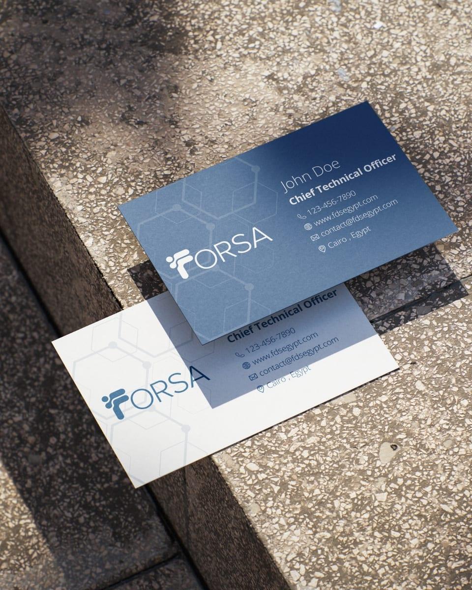
In Use

The Delivery
01
Logo Suite
Full lockups and icon marks in color, black and white. High-res PNG for print and screen, SVG for infinite scale, and favicons for app use.
02
Typography
The full Proxima Nova family, packaged with weights from Light to Black and usage guidance.
03
Launch Campaign
Five launching posts introducing the new identity to Instagram.
04
Brand Guide
The final identity manual: logo construction and clear space, color, type, and application rules.
Credits
- Client
- @forsadigitalsolutions
- Partner
- @lailaaboelezz
- Design Lead
- @lailaaboelezz
- Creative Directors
- @lailaaboelezz @shehabzakiii @alisleem04
- Agency
- @schwarzandblanco
- Project Managers
- @shehabzakiii @alisleem04