Selected Work
Showing 3 of 3
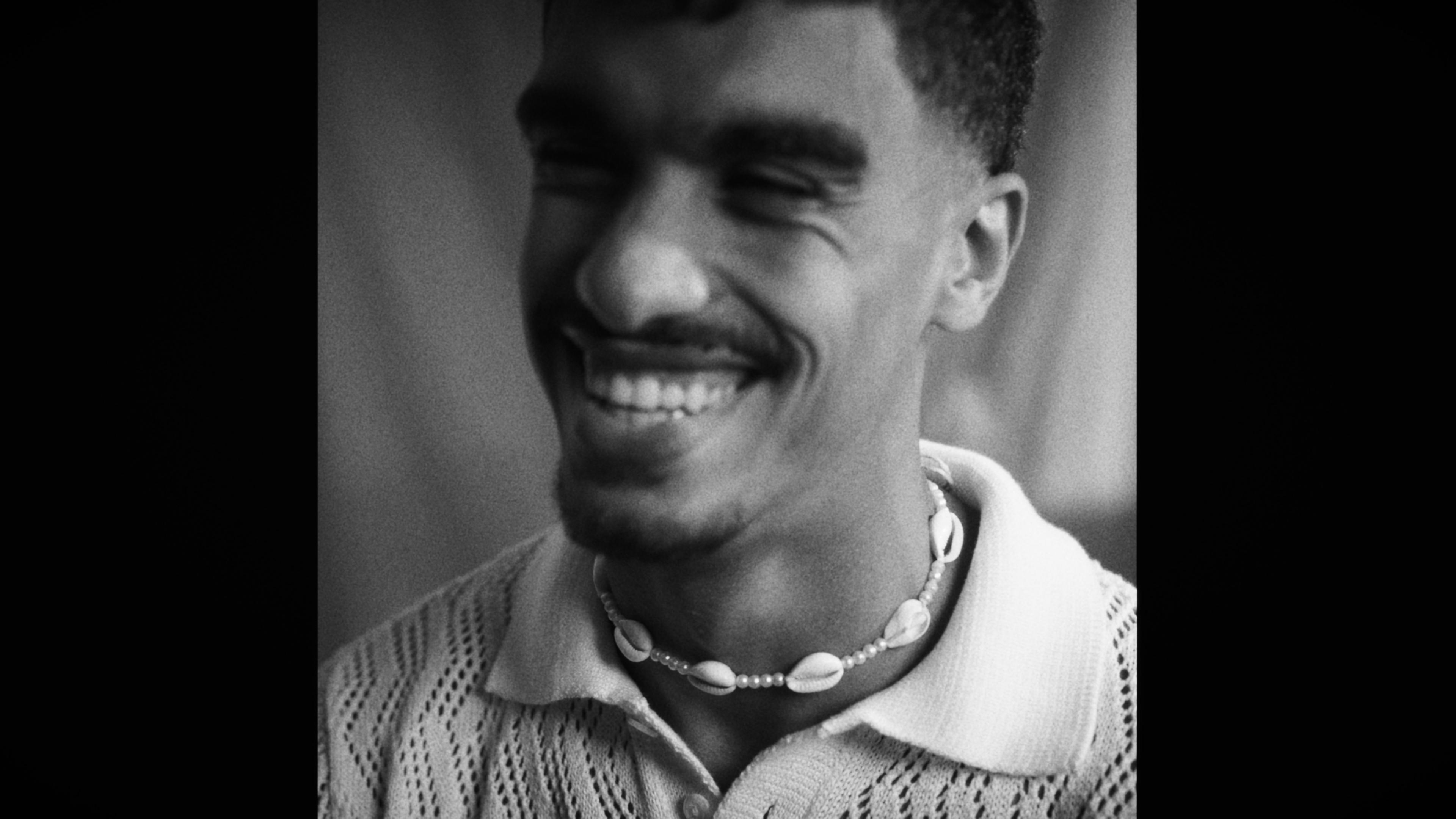
A short experimental portrait for LOOM, made on the contrast its title names: light against shadow, stillness against movement, one long take at its centre. Directed, shot, cut and graded in-house.




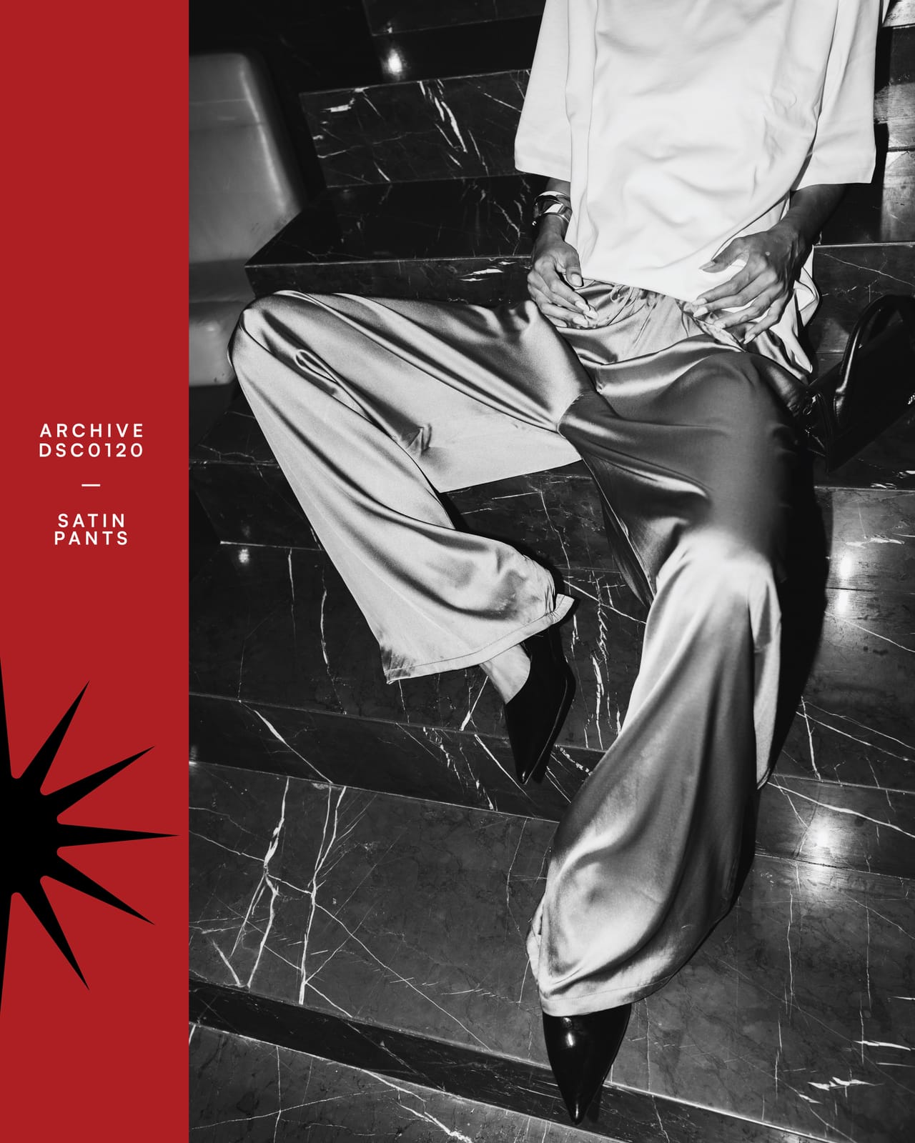
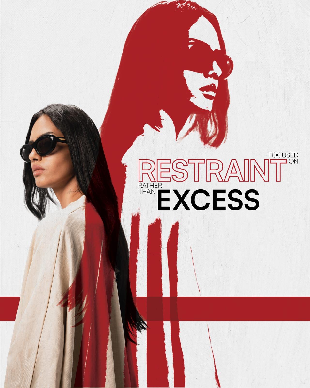
The debut editorial for Shahd Gohar's own label, shot and designed in-house on a brief clear in its contradiction: designs that speak through restraint, shot to be seen. Linen and satin against stone, then a fragmented grid that breaks the cover apart the way brutalist architecture breaks a skyline, with a single red mark the only colour allowed to interrupt it.



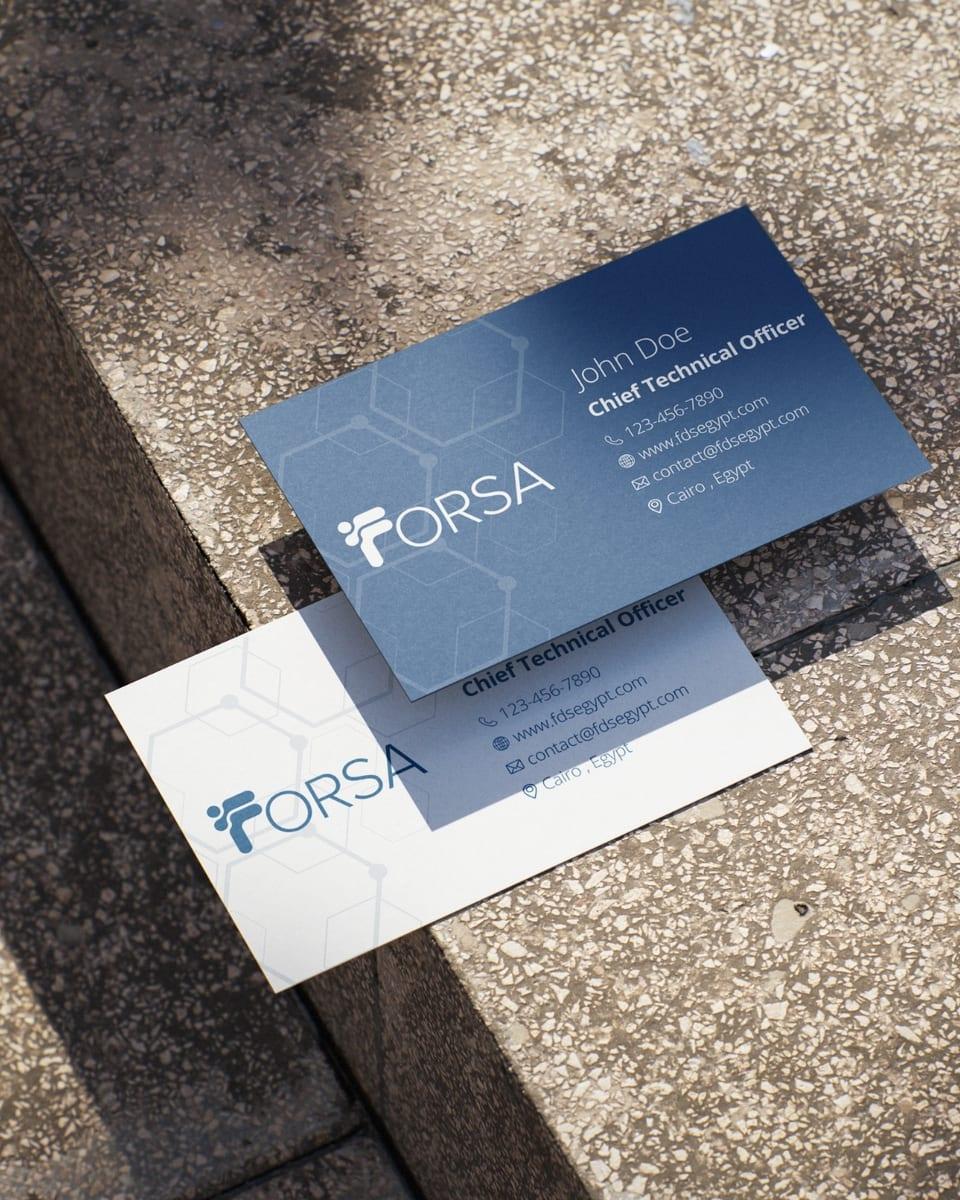
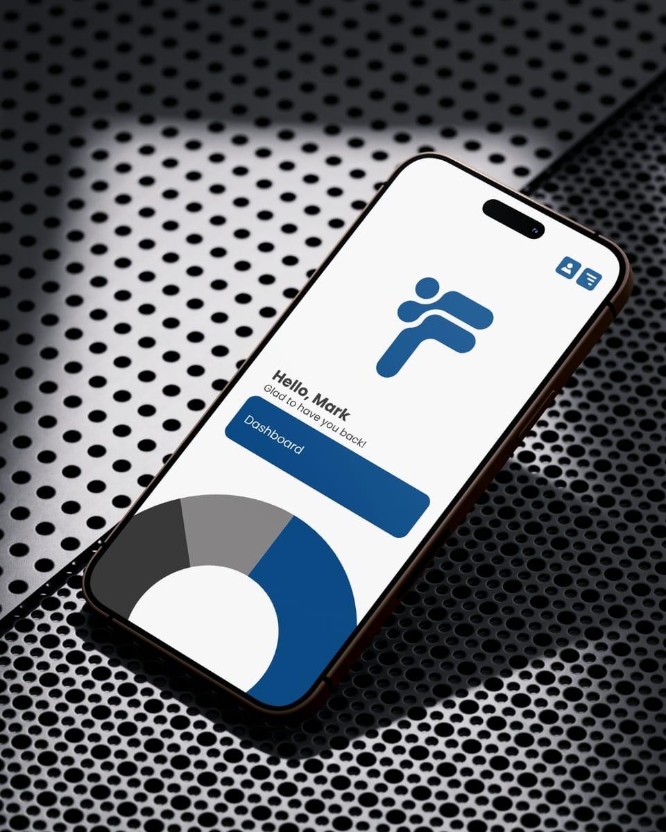
A new visual identity for a startup turning messy data into decisions small businesses can act on. The mark is built from statistical bars and circles resolving into an F, and runs from there through type, stationery, interface and signage.