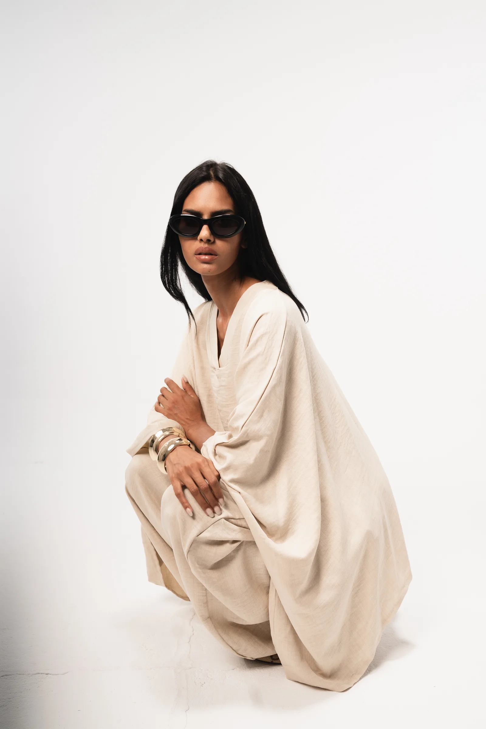
Photoshoot & Editorial
SHAHDGOHAR
SHAHD GOHAR
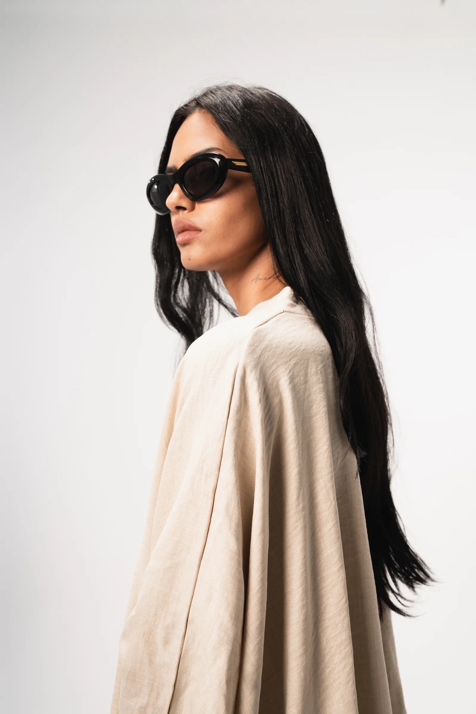
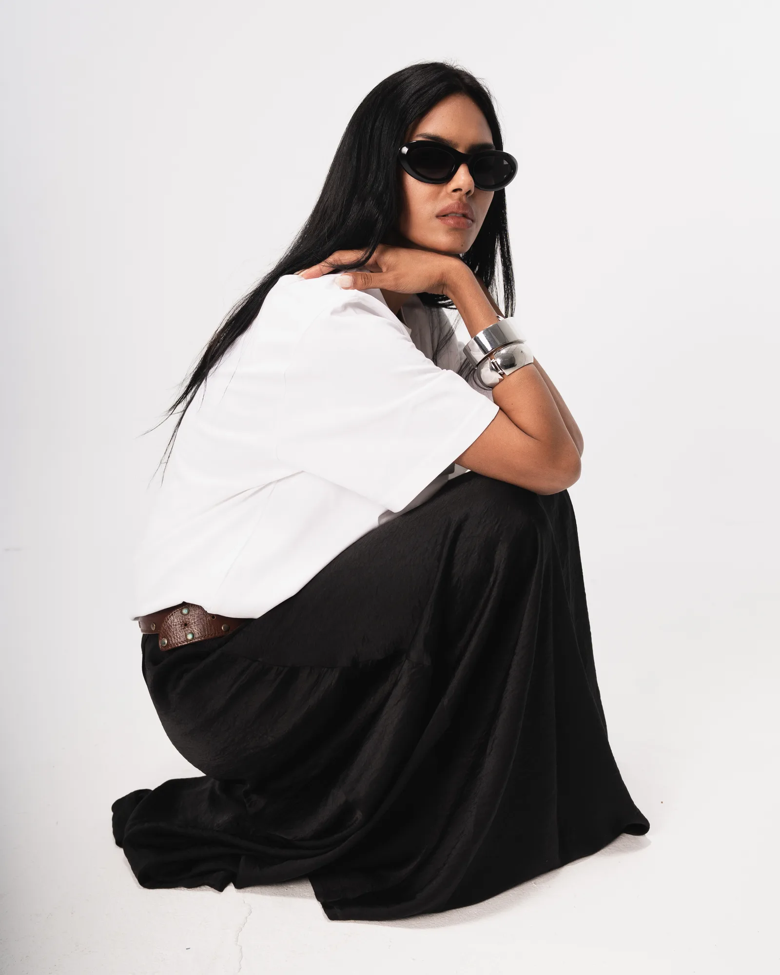
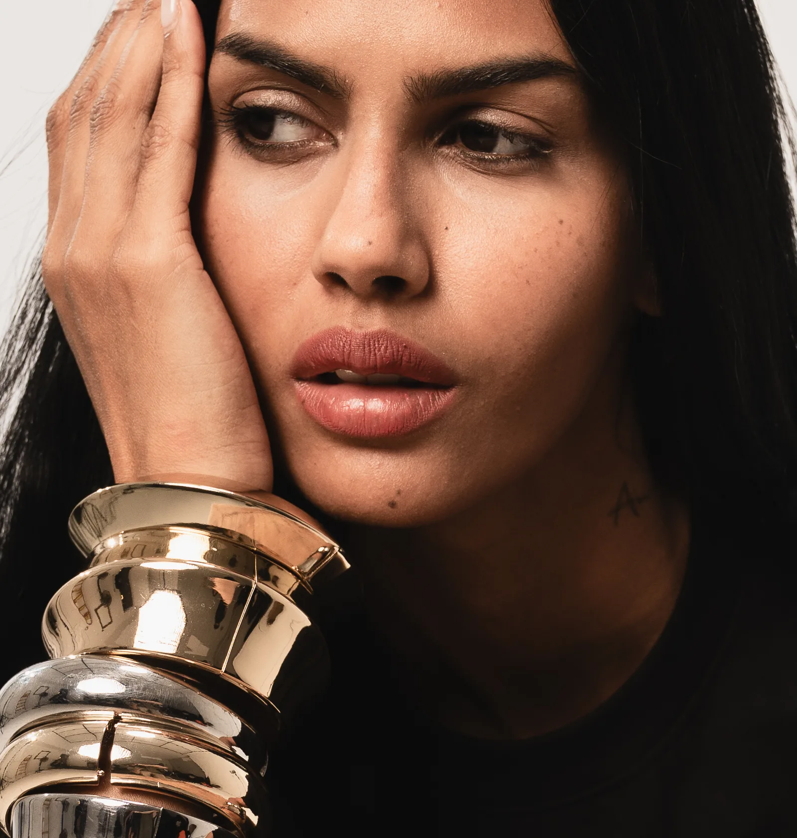
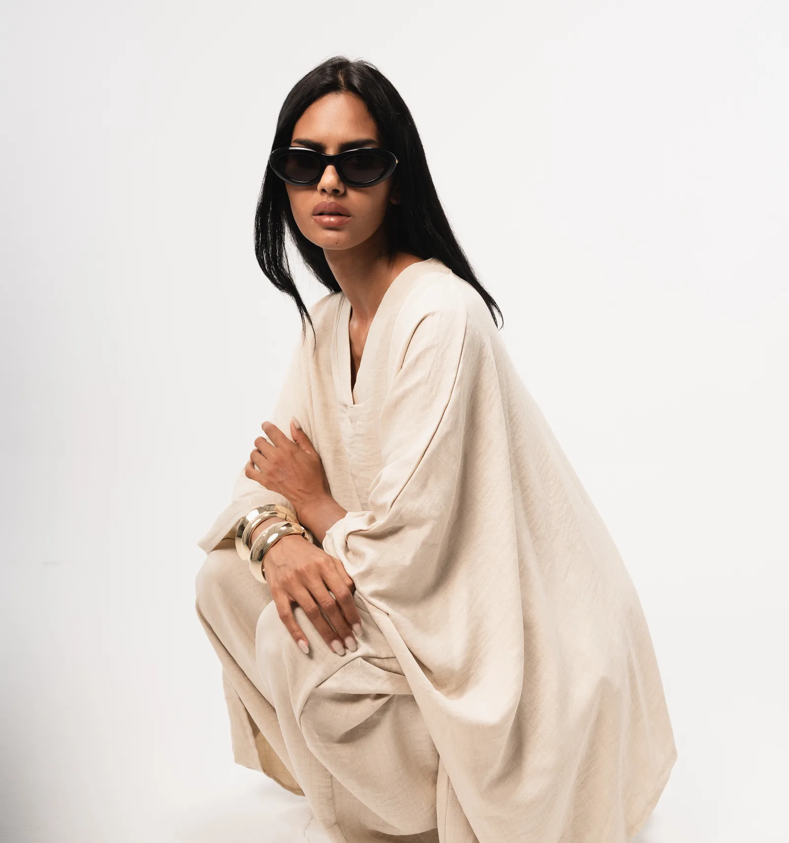
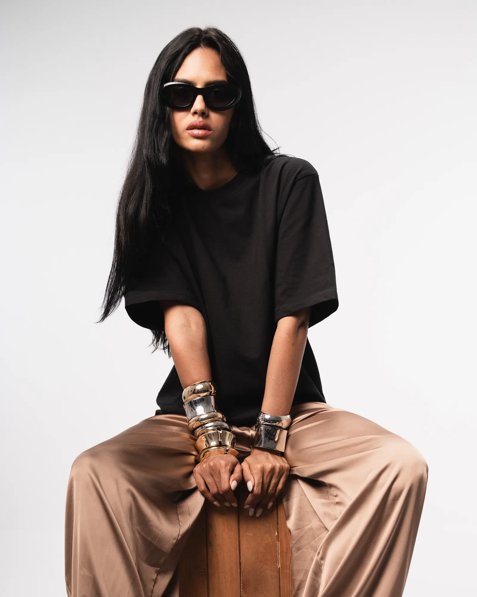
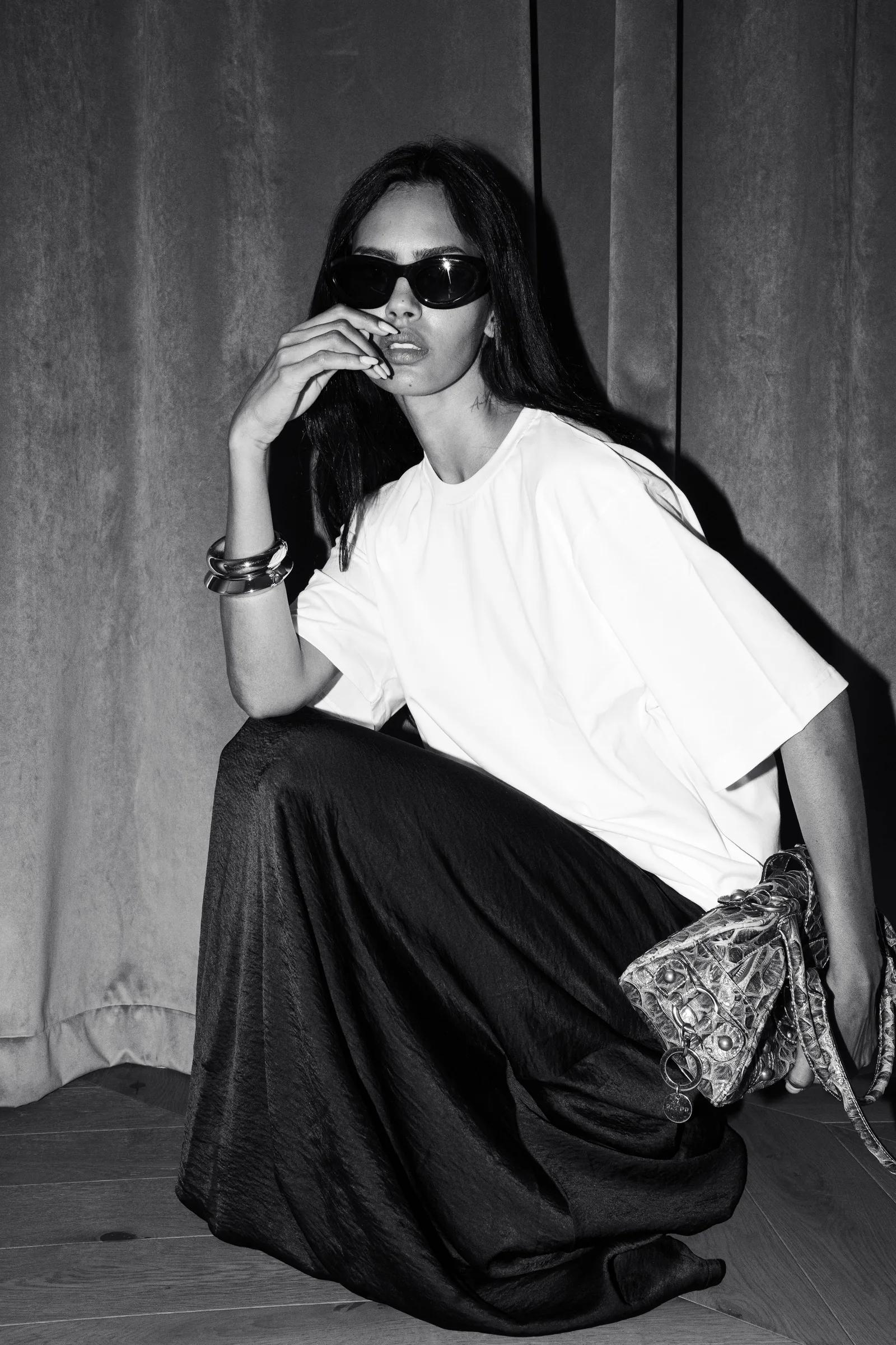
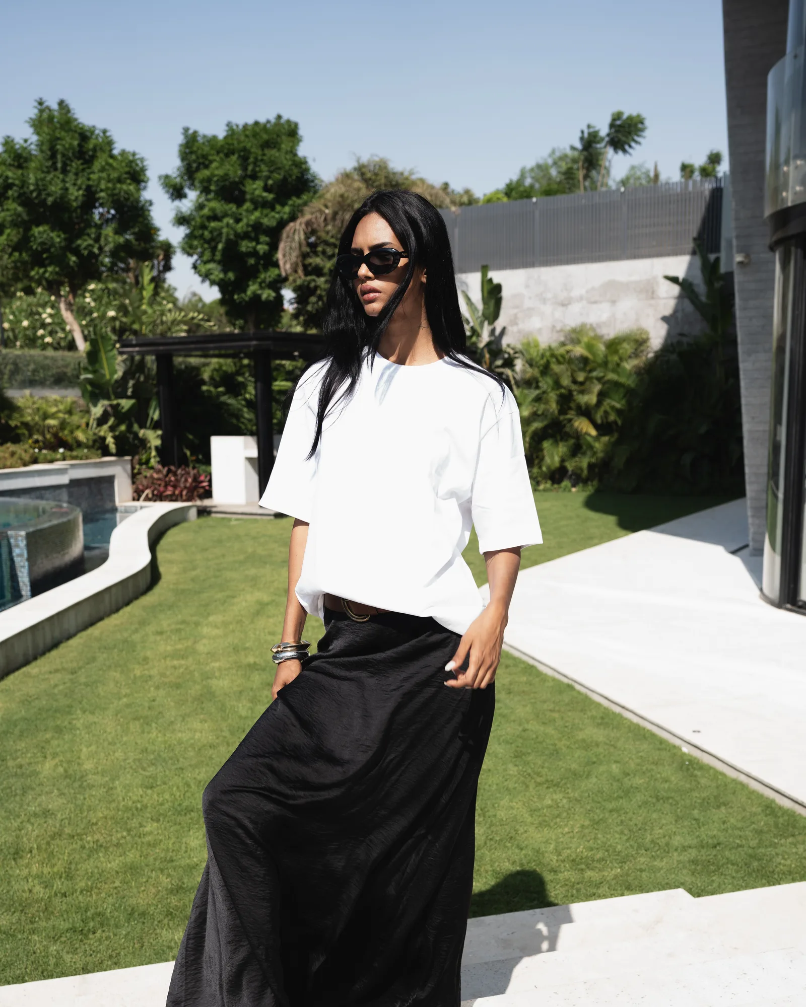
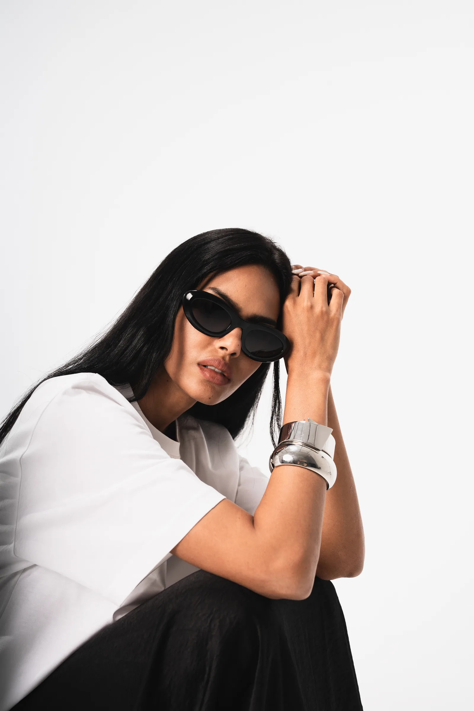
SHAHD GOHAR commissioned us to shoot the debut editorial for her personal label: a modest, brutalist approach.
The Brief
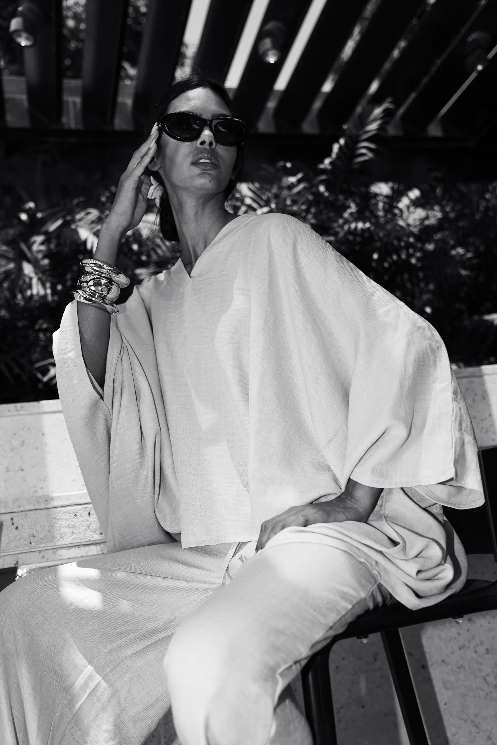
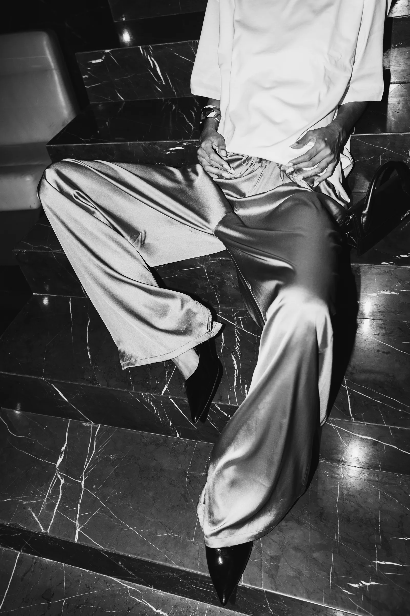
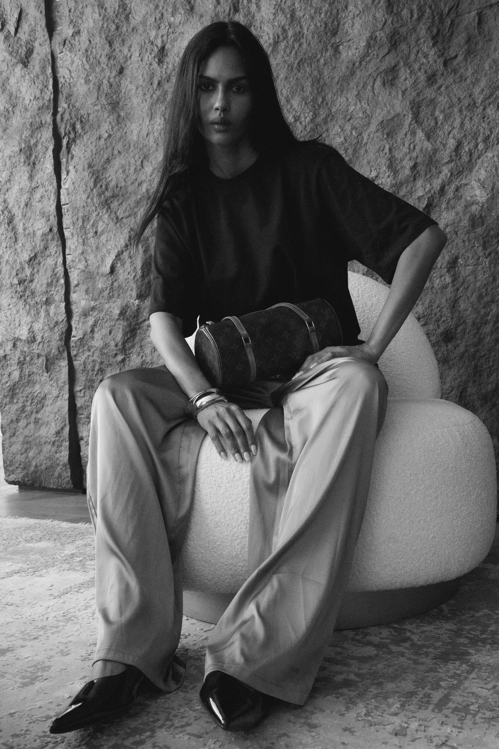
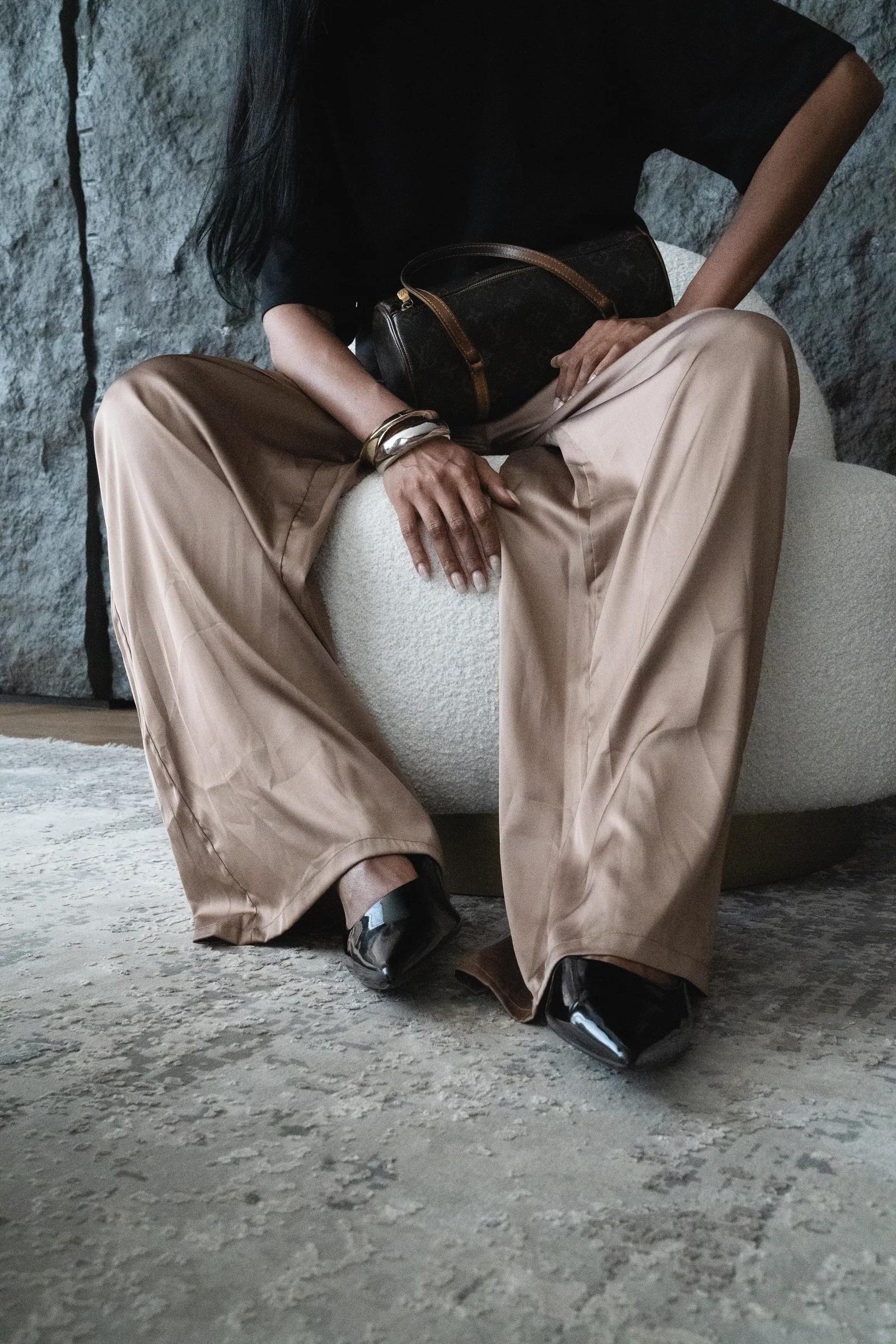
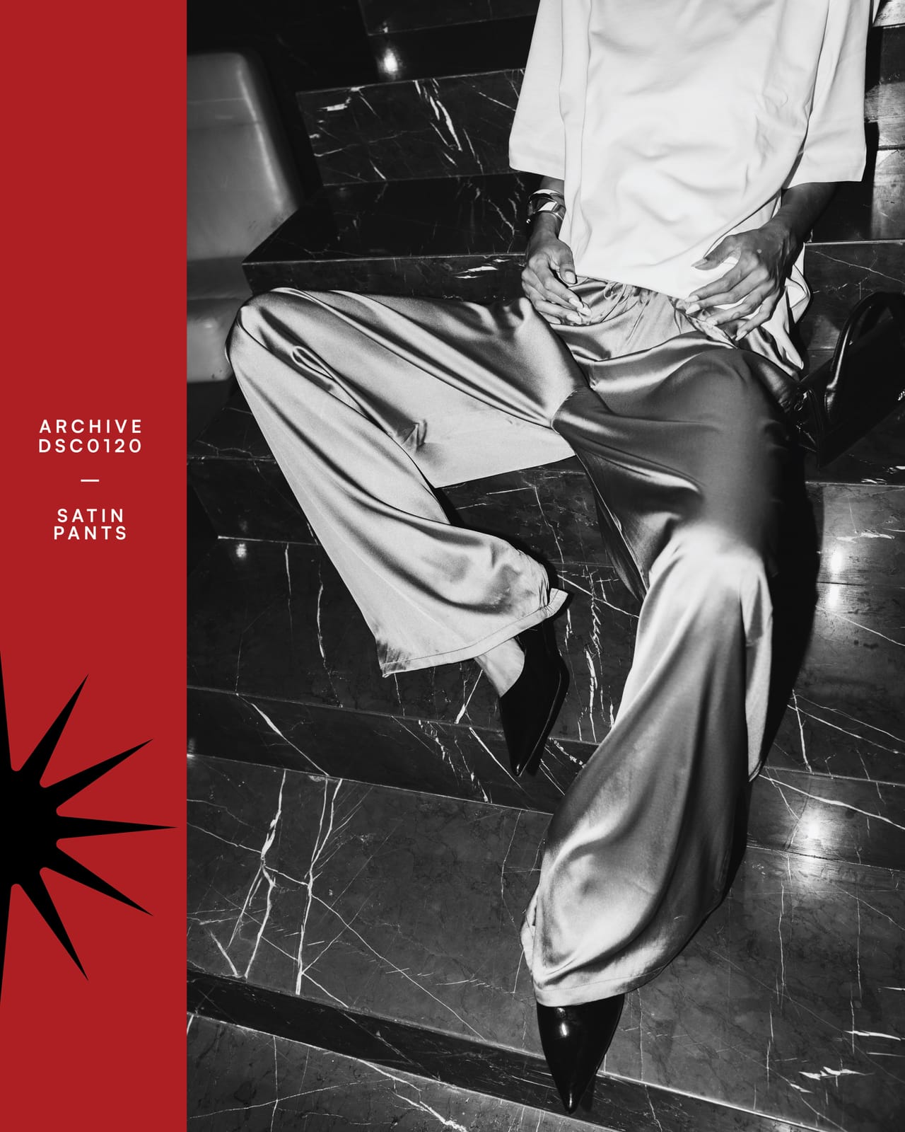
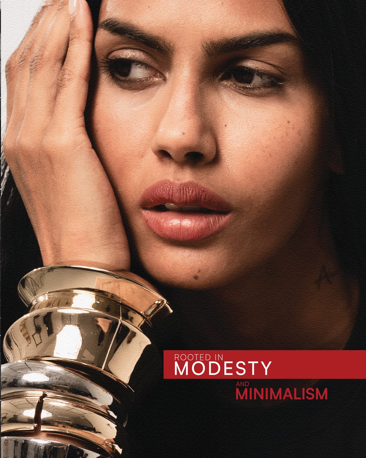
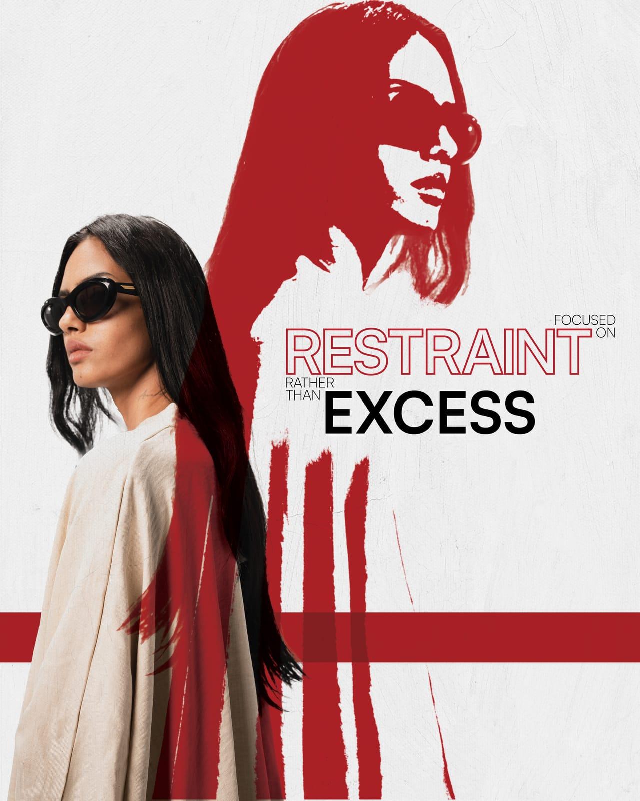
The brief was clear in its contradiction. Shahd's designs speak through restraint. Linen sets, a skirt, satin pants, and silhouettes that cover rather than reveal.
We wanted the visual language to hold that same meaning with a little twist: raw concrete and marble as the setting.
Texture
Satin against stone,
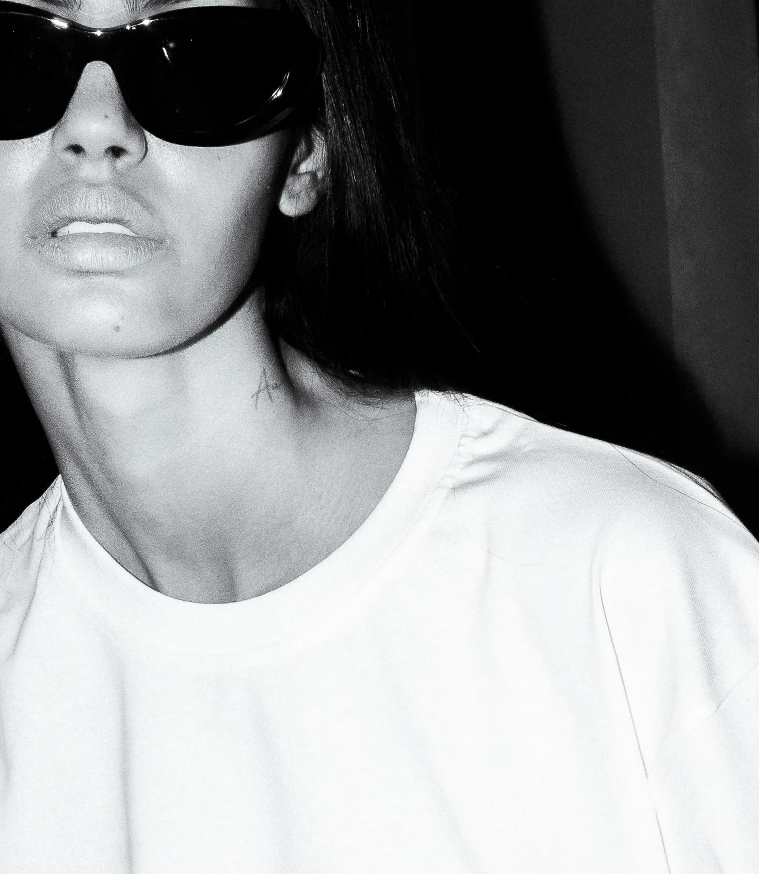
linen against light.
We started by focusing on texture. The work led us somewhere more precise.
Visual Direction
Hard geometry in the graphic treatment, a bit of warmth in the color work, and a restraint in framing that lets the silhouette speak before anything else does.
Photography
The Editorial Design
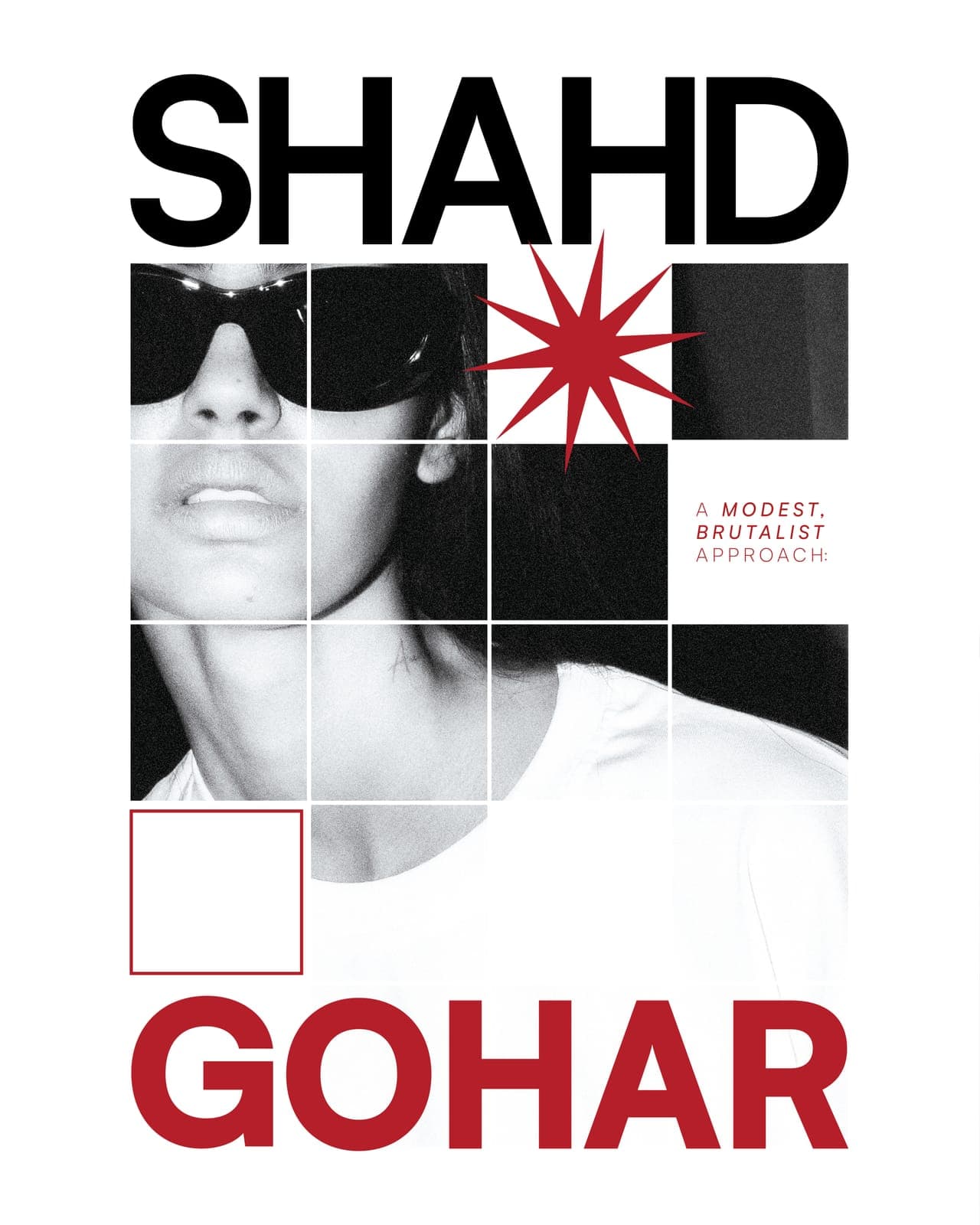
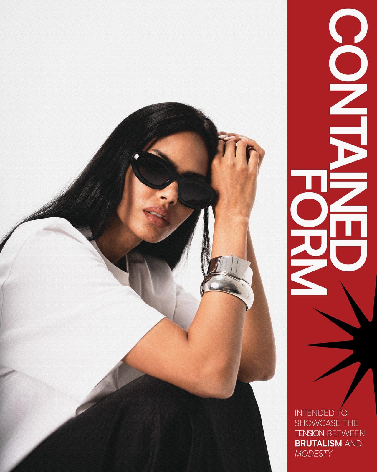
The editorial design carries the same tension forward. The fragmented grid across the cover breaks the image apart the way brutalist architecture breaks a skyline. Deliberate, structural, unresolved until you step back.
A single red mark cuts through the composition throughout, the one moment of color allowed to interrupt the black and white, controlled the same way the styling is controlled. Nothing decorative, everything intentional.
Featuring
@aleholandaaCredits
- Client
- @shahdgohar___
- Creative Directors
- @shahdgoharrr @alisleem04 @shehabzakiii
- Agency
- @schwarzandblanco
- Design Lead
- @lailaaboelezz
- Production House
- @sbproductiions
- Photography
- @alisleem04
- Executive Producers
- @shehabzakiii @alisleem04
- Producer
- @_ahmedalyyy