[ Set with care ]
Pages thatknow their order.
- Lookbooks
- Decks
Lookbooks, publications and decks, typeset properly, for print and for screen.
Hierarchy, rhythm and a grid that survives contact with real copy, including the piece that runs twice as long as anyone budgeted for.
Schedule a call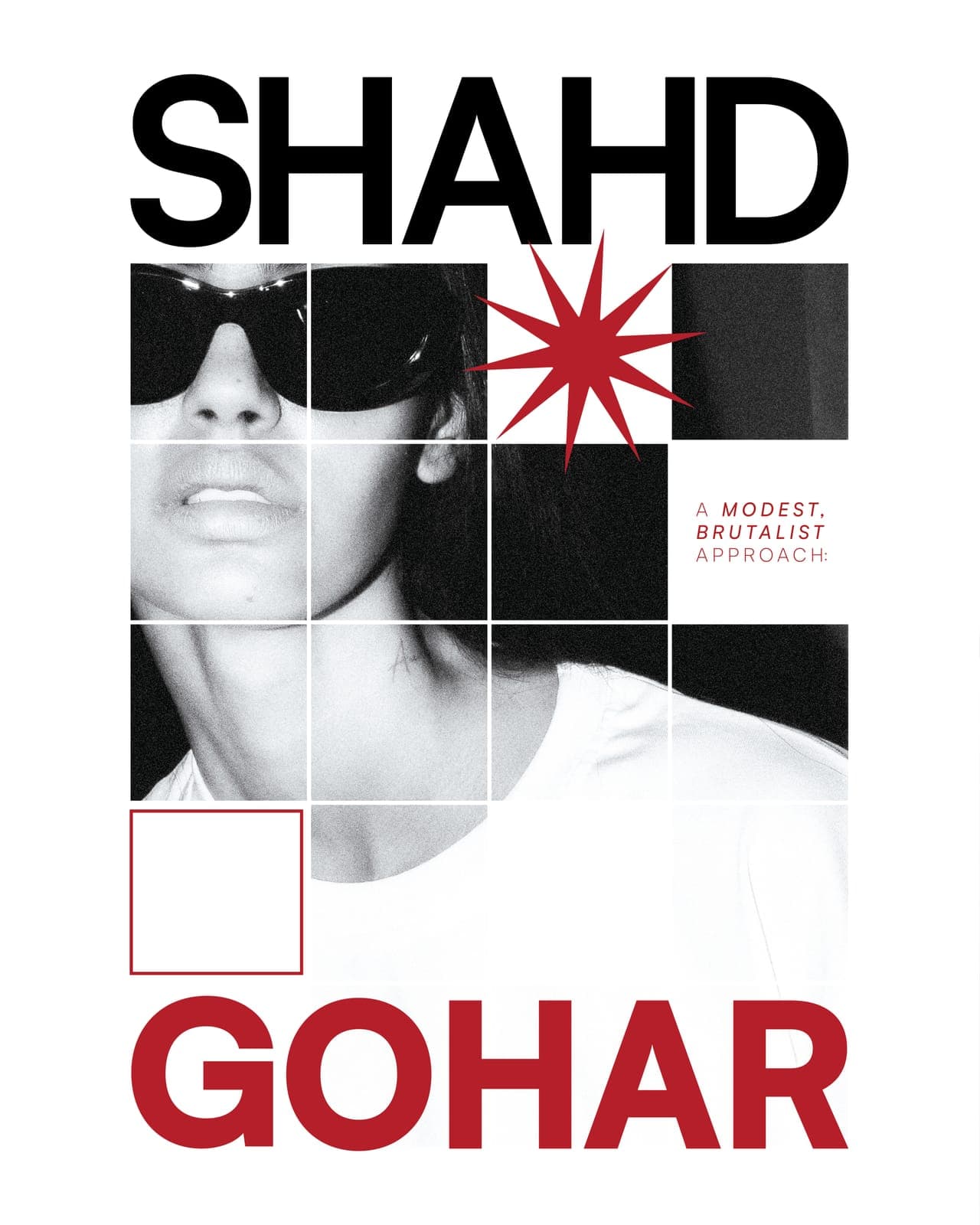
Print work is delivered press-ready with the printer spoken to first: stock, bleed and finishing agreed before layout, because those three decide more about the design than most people expect.
See the work →[ The process ]
Editorial is built from the inside out: the grid, then the run of pages, then type, then color. The cover is the last thing designed, not the first.
Phase 01
The grid first
One grid, decided against the longest and the shortest piece of real copy there is. Designing a spread before the grid means every later page negotiates with that spread instead of with the system.

Phase 02
Sequence, not spreads
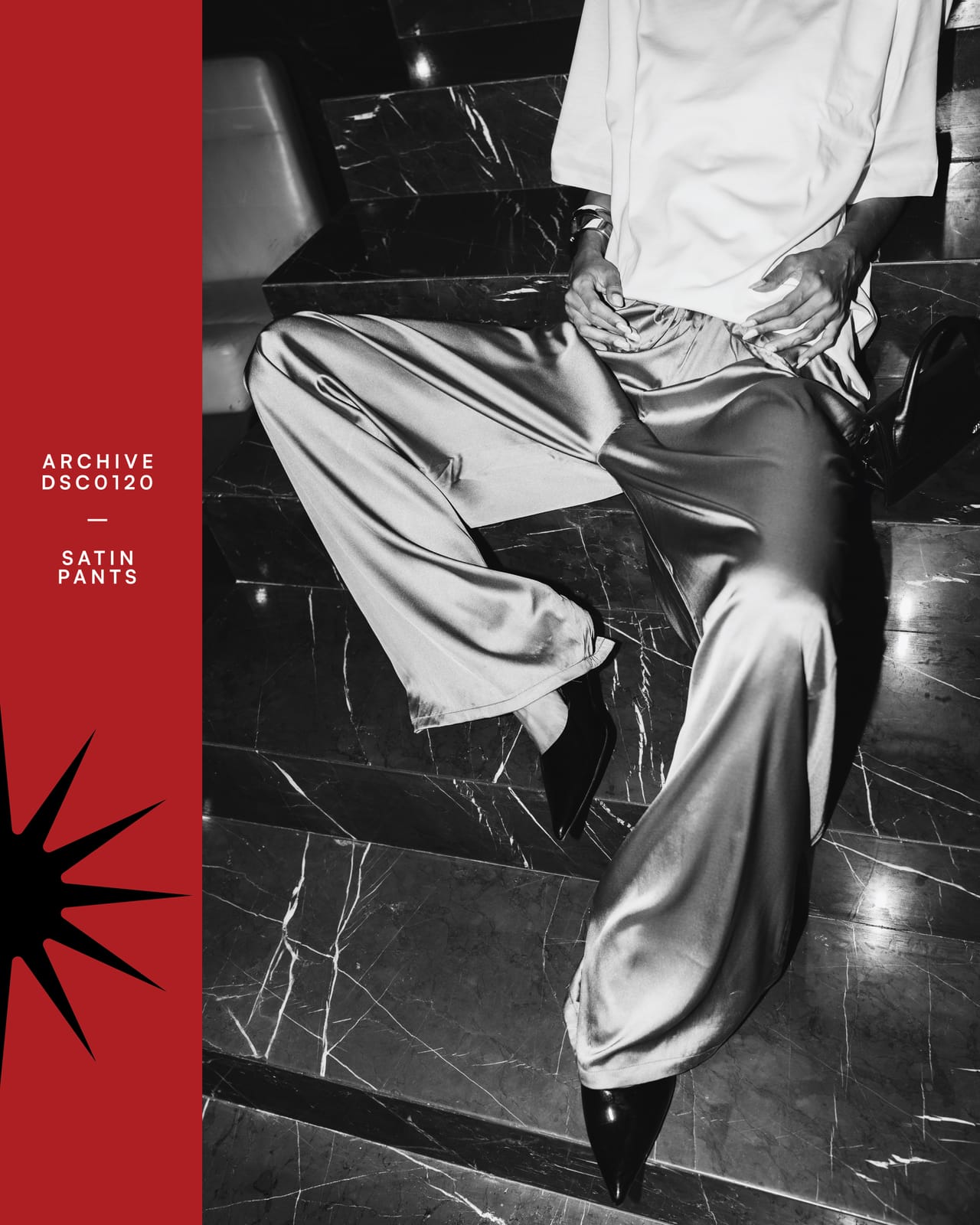
Pages are laid out as a run and reviewed as a run, thumbnails on a wall, in order. It's the only way to see pacing. Two loud spreads in a row read as one, and a quiet page is what makes the next one land.
Phase 03
Type does the talking
Three sizes, set properly, will do more than eight sizes chosen page by page. Once the scale is fixed, most of the remaining work is deciding where to break a line.

Phase 04
Color, rationed
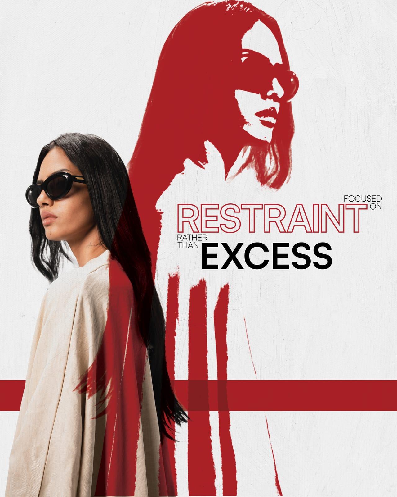
One accent, used on purpose and rarely. The publication is black, white and one red; the red only ever marks the thing the page is actually about, so it never has to shout to be noticed.
“Nobody notices good typesetting. They just get to the end of the page without deciding to stop.”
- What you get
- Press-ready artwork
- Covers
- Lookbooks, decks, reports
- Includes
- Grid, type system, cover
- Handled
- Print liaison
- Timeline
- 3 to 6 weeks